 Back in in my retail days when I managed a large sporting goods chain store, we were constantly being sent merchandising and POP kits for Christmas, the back to school season or for the release of the new Jordan’s, and they all had one thing in common – they were designed to create excitement and get people to walk into our store.
These merchandising changes not only made the store look good, they also got the sales team excited. We all got commission on sales and wanted something that would make our jobs easier by getting people in the store so we could capitalize on that excitement and make the sale.
What does this have to do with your website? Well, when was the last time you actually dusted the cobwebs off your site and freshened things up? If you can’t pinpoint the last time you and your site spent a little quality time together or, heaven forbid you can’t even remember what it looks like, you definitely need to keep reading. Start by looking at your website stats. You likely get a lot of return visitors, and you need to be sure to give them a reason to keep coming back!
Updating your site doesn’t mean just loading your newest inventory – having this content up-to-date is no longer optional! You need to dedicate time to your site on a weekly basis to ensure you’re creating the same excitement about what’s new and your best deals that you’ve created in your store. Your manufacturers have new products coming out, seasonality dictates shifts in your business focus and your OEMs are always running some sort of sales promotion – be sure your site reflects these updates to feel truly in sync.
Look at the big box websites like Best Buy, Target and Walmart. Their offers change weekly to reflect what they’re promoting in their print ads. Are you following suit with these major brands that are some of your toughest competition for a consumer’s limited discretionary dollars?
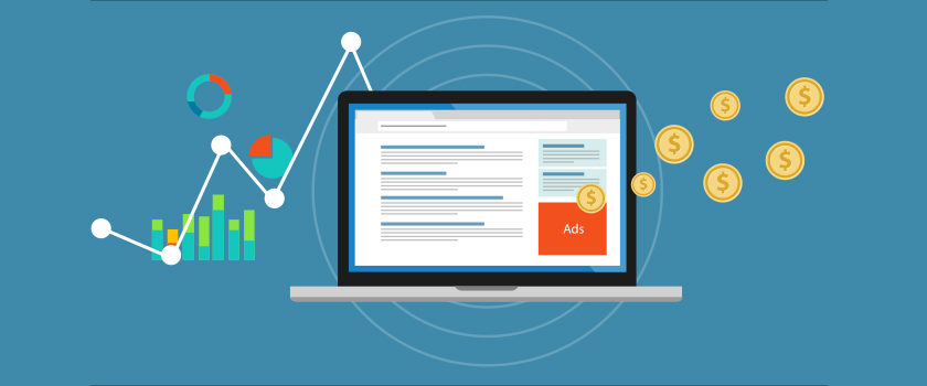
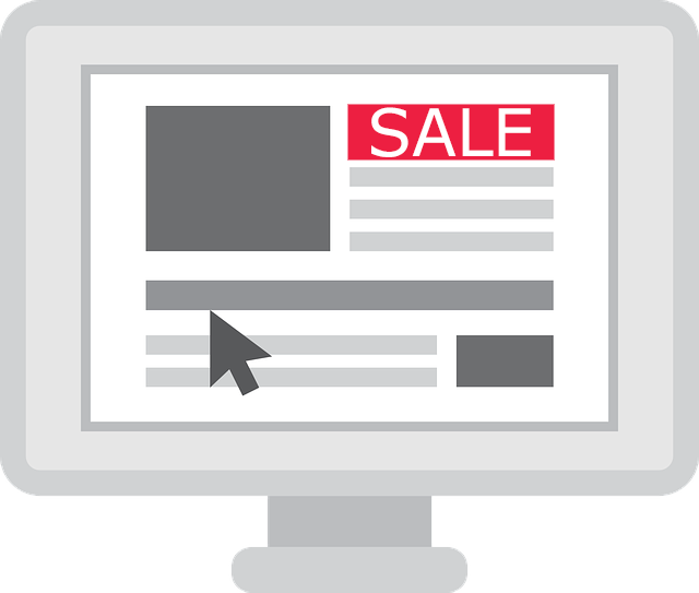
The best place to promote your offers is through prominent banners on your home page that make customers want to learn more and take an action. Please, take the time to create banners that don’t look like my 4-year-old daughter designed them. Yes, some are that bad (although she just won a coloring contest, so give her a few years, and she might just be able to take your digital marketing to the next level).
A well-designed ad should be impactful and present a compelling offer that appeals to the masses. In many cases the manufacturers have banner ads that you can utilize, just be sure that you’re adding some of your store’s own offers to the mix to add your own personality. For example, if you have some great deals on non-currents, create a cool banner and link it to a landing page featuring the product group.
Limit the number of banners that rotate to about 5 or 6 – no one is going to scroll through 20 banners. You also don’t want your homepage to be a mile long with stacked sales fliers plastered one on top of the other.
Lastly, remember that search engines can’t read text on your banner images, so create ALT tags with descriptions that tell the search engines exactly what you’re highlighting on your site.
Taking the time to update your homepage with your latest and greatest offers is sure to drive more traffic throughout your entire website and more importantly to your brick and mortar store – a true step toward a banner 2016.