
 According to Litmus, more than 80 percent of mobile users will not engage with emails that aren’t mobile-friendly.
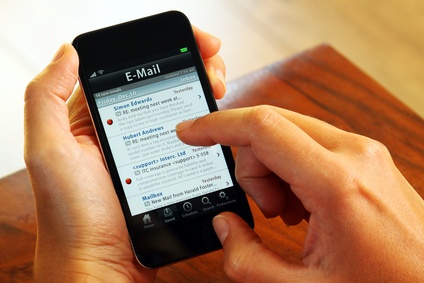
Yet, surprisingly, most businesses remain with a one-size-fits-all email mindset and fail to accommodate the more than half of people that open emails on mobile devices.
Are you adapting to how your potential buyers consume email content on mobile? If not, you may be forfeiting the business of your growing mobile audience. So, before sending your next marketing email, ensure it’s mobile-friendly and review these best practices to capture the attention of every potential customer.
Bigger is Better. I guarantee the large font of this text stood out to you. To make sure your email is noticed, opened and easily readable, your headline font size should be set to 22 pts or larger, and the body copy font size should be 14 pts or larger. Never send an email with a font size lower than these recommendations, as it may cause a device to automatically increase your font size and completely reformat the design of your email.
Get to the point. Depending on what mobile device is being used, you may only have 27-30 characters to utilize in the subject line. That’s why you want to load the most compelling content first, in as few characters as possible. Often times, this is even more important than the content itself, as it grabs the reader’s attention and encourages them to click-through.
In some cases, the pre-header text – the brief summary located under the subject line – is granted more room than the subject line based on how the device is being held. Take this as an opportunity to convey the importance of the email as quickly as possible.
Make it easy to read. There is nothing worse than opening an intriguing email only to find it difficult to read on your smartphone with long-winded paragraphs and irrelevant images.
Reading mobile emails is often times done while engaging in other activities like eating, conversing or watching television. You need to make it easy for your prospective buyer to easily read and scan your content. Avoid writing long paragraphs, instead, use headers, bullets or numbers and short paragraphs to visually space out your content for easy consumption.
Display a clear Call-to-Action (CTA). Your mobile CTAs are the most critical element of your entire email campaign. Taking action is what you want your prospect to do, so make it easy and obvious for them.
Always use mobile-optimized CTA buttons, never links, for large fingers to click on. Apple encourages making touch buttons a minimum of 44 pixels square for mobile devices, while leaving plenty of surrounding space to avoid a “mistap”.
Now, once you have created your CTA, place it above-the-fold and as close to the top of the email as possible. Never make a prospect scroll through your content to find your CTA, because odds are, they won’t.
Most mobile CTAs are of the click-to-call variety – consider utilizing these as often as possible to immediately convert a prospect into a lead. It’s much easier for a mobile prospect to call in than fill out a form.
Creating mobile-optimized emails isn’t the end of the reader’s journey. Once they’ve engaged with you through email, provide them with a mobile-friendly website experience to browse the products and services you offer.
Need help optimizing your emails? Connect with ARI’s Digital Marketing Services Team.